Why do we love blue? Look up! The wonder of the sky promises endless possibilities and airy spaces. It allows you to breathe, something we all need in this busy modern world.

Colour Theory cites blue as a symbol of integrity, something to trust which inspires calm. These feelings embodied in colour provides peace and wellbeing: the tranquillity of blue feeds our soul in this way.
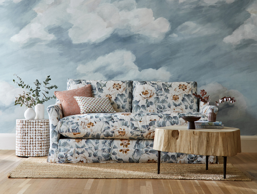
To bring this emotional response to our homes we can paint the wall, cover our furniture, play with pattern and embrace print. But how do we know where best to use them? And can we mix them? Just like the sky varies in tones, so do the shades of blue available for our homes.
When you stand in the centre of your home, which direction do you feel drawn to? Many of us veer to the light, like cats we gravitate to the sunny spots. Rooms facing south have brighter, warmer light and we can use whiter, lighter tones to enhance and echo the natural exposure. These shades are ideal for active rooms, rooms we do "living" in. The soft pale tones are fresh and invigorating like a summer breeze.

Try Airlane Blue from Sanderson for that summer sky feel.
North facing rooms get little light in the UK and what light there is will be cool. Use a warm blue with a yellow base to counteract the chill. Going dark in an already dark room embraces the shade and cocoons you. Try a navy on all walls and balance with rust orange accents, warm wood and gold metal details to really add comfort.

Try Inky Fingers from Morris & Co
A proper assessment of how you use the space will be required for a west facing room. With cool mornings and warm evenings your colour choice for this room will need to be a changeling just like the light, shifting from true blue to soft silver.

Try Zoffany's Quarter Quartz Grey
East facing rooms are the opposite with their morning warmth and muted cool evenings. Keep it vibrant for the start of your day with a bright blue kitchen with fun yellow splashes. Or for an restful bedroom mix a deep mid blue with soft biscuit taupe for a grown up contrast scheme.

Dearle by Morris & Co
Whichever blue you choose, you can be sure there is a place for it in your home.